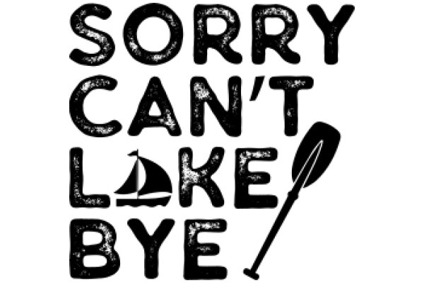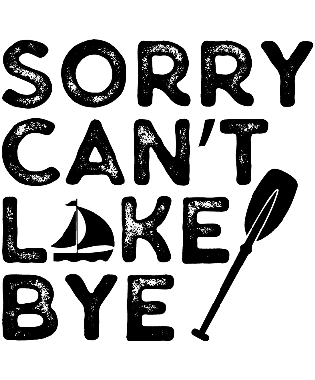
The image features a black and white illustration with a playful and somewhat humorous message. The text "Sorry can't like bye" is prominently displayed in a casual, hand-drawn font, suggesting a light-hearted tone. The words "Sorry" and "bye" are in a larger font size, while "can't" and "like" are smaller, creating a visual hierarchy that draws attention to the sentiment. Adding a touch of whimsy, a small black silhouette of a sailboat is positioned to the right of the text. The boat is simple in design, with a triangular sail and a single mast. Its placement next to the text creates a visual connection between the message and the boat, possibly implying a journey or a farewell. The overall style of the image is reminiscent of a hand-lettered sign, giving it a personal and informal feel. The use of black and white adds a classic and timeless quality to the image.
Sorry, I Can't Like You Bye
Design this TShirt
Design this Mug
Design this Sticker
Download for personal use
Product
Add to cartShare on Facebook
Share on X
Share on Pinterest
Other Designs
