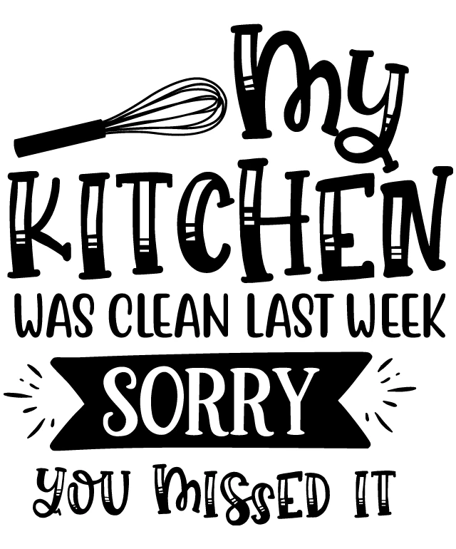
The image features a black and white illustration of a kitchen scene. At the top, there's a large spoon with a handle, symbolizing the culinary theme. Below the spoon, the words "MY KITCHEN" are written in a stylized font, suggesting a personal or branded kitchen. Further down, there's a banner with the text "WAS CLEAN LAST WEEK SORRY YOU MISSED IT" in a casual, handwritten style. The text is playful and humorous, implying that the kitchen was tidy but the person who wrote the message missed the opportunity to appreciate it. The overall style of the image is whimsical and informal, with a touch of humor. It seems to be a light-hearted, personal message rather than a formal advertisement.
Like
My Kitchen Was Clean Last Week, Sorry You Missed It
$22.95 USD Sale price $20.00 USD
Design this TShirt
Design this Mug
Design this Sticker
Download for personal use
Product
Add to cartShare on Facebook
Share on X
Share on Pinterest
Other Designs
