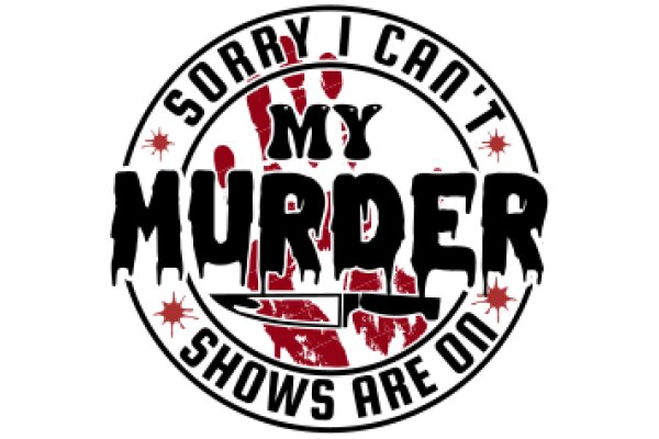
The image features a graphic design with a white background. At the top, there is a stylized text that reads "Sorry I can't my cal says No." The text is written in a handwritten font with a slight cursive effect, giving it a casual and friendly appearance. Below this, there is a larger text that says "Sorry I can't my cal says No." The word "Sorry" is in a larger font size than the rest of the text, drawing attention to it. The word "my" is emphasized by being in a larger font size than the word "cal," which is in a smaller font size. At the bottom of the image, there is a small graphic of a fish, which is a common symbol for "no" in some cultures. The overall style of the image is simple and cartoonish, with a clear message conveyed through the text and graphic elements.
Apology for a Mistaken Calculation
Design this TShirt
Design this Mug
Design this Sticker
Download for personal use
Product
Add to cartShare on Facebook
Share on X
Share on Pinterest
Other Designs
