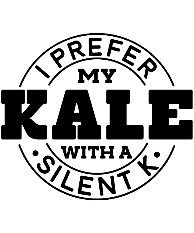
The image features a logo with the text "I PREFER MY KALE WITH A SILENT K". The logo is circular and has a black and white color scheme. The text is arranged in a way that the words "I PREFER" are at the top, "MY KALE" is in the middle, and "WITH A SILENT K" is at the bottom. The word "KALE" is emphasized by being larger than the other words. The overall design is simple and clear, with the text being the central focus. The logo seems to be promoting a preference for kale, possibly suggesting a healthier or more natural way of consuming it.
Like
Prefer My Kale with a Silent 'K' Logo
$22.95 USD Sale price $20.00 USD
Design this TShirt
Design this Mug
Design this Sticker
Download for personal use
Product
Add to cartShare on Facebook
Share on X
Share on Pinterest
Other Designs