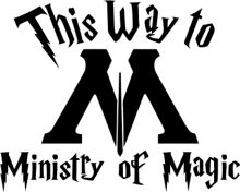
The image features a striking logo for the Ministry of Magic. Dominating the center of the image is a large, stylized letter "M", which is the initial of the Ministry. The "M" is intricately designed with a sunburst at its heart, adding a dynamic element to the logo. Beneath the "M", the words "Ministry of Magic" are written in a bold, sans-serif font. The text is clearly legible and is positioned directly under the logo, reinforcing the connection between the two. At the bottom of the image, the phrase "This Way" is written in a smaller, italicized font. This phrase is likely a call to action, inviting viewers to follow the path of the Ministry of Magic. The arrow pointing to the right suggests a direction, further emphasizing the idea of a journey or path. Overall, the logo is a powerful representation of the Ministry of Magic, with its bold design and clear messaging. It effectively communicates the identity and purpose of the organization, while also inviting viewers to explore further.
Ministry of Magic: This Way
Design this TShirt
Design this Mug
Design this Sticker
Download for personal use
Product
Add to cartShare on Facebook
Share on X
Share on Pinterest
Other Designs
