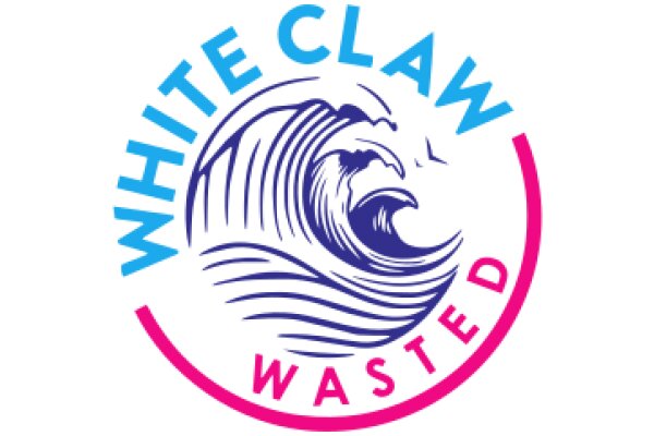
The image features a logo with the words "WHITE CLAW WASTED" prominently displayed in a circular fashion. The text is in a bold, sans-serif font, with "WHITE CLAW" in a larger size than "WASTED." The words "WHITE CLAW" are in blue, while "WASTED" is in pink. In the center of the circle, there is a stylized depiction of a wave, rendered in a combination of blue and white. The wave appears dynamic and is likely intended to represent the brand's association with the ocean or surf culture. The overall style of the logo is clean and modern, with a clear emphasis on the brand name. The use of bold colors and a simple, yet recognizable, design suggests that the logo is likely intended for a product or service related to the ocean or surf culture, given the wave imagery.
White Claw Wasted: A Graphic Design
Design this TShirt
Design this Mug
Design this Sticker
Download for personal use
Product
Add to cartShare on Facebook
Share on X
Share on Pinterest
Other Designs
