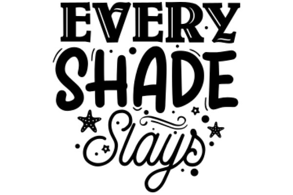
The image features a striking graphic design. Dominating the center of the image is the phrase "Every Shade Stays" written in a bold, cursive font. The text is arranged in a way that the words "Every Shade" are positioned above the word "Stays", creating a balanced visual effect. Adding a touch of whimsy to the design, there are small stars scattered around the text. These stars are also in black and white, maintaining the monochrome theme of the image. The stars are not uniformly distributed but rather appear randomly, adding a sense of spontaneity to the overall design. The background of the image is plain white, which makes the black text and stars stand out prominently. The simplicity of the background ensures that the viewer's attention is drawn to the text and stars, emphasizing the message of the design. Overall, the image is a harmonious blend of typography and graphic elements, creating a visually appealing and thought-provoking piece of art.
Every Shade Stays: A Graphic Design Poster
Design this TShirt
Design this Mug
Design this Sticker
Download for personal use
Product
Add to cartShare on Facebook
Share on X
Share on Pinterest
Other Designs
