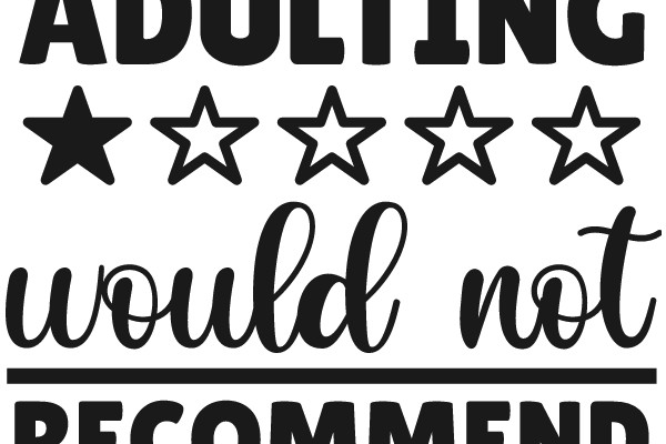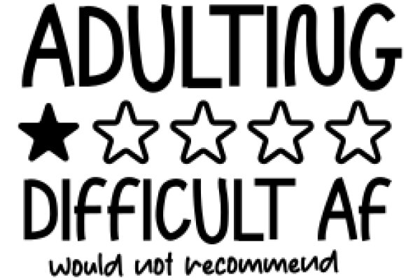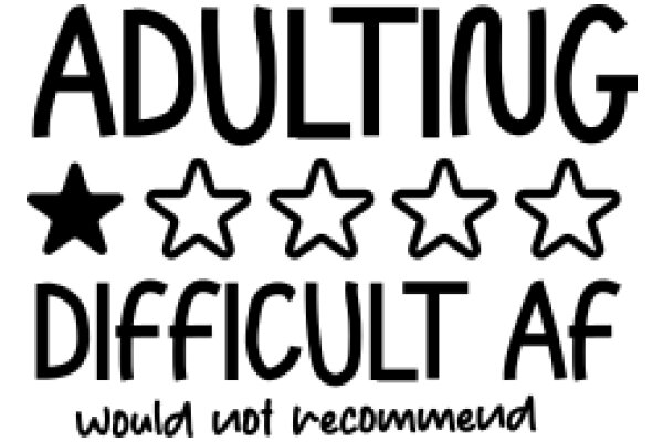
The image features a graphic with the word "ADULTING" prominently displayed at the top. Below this, there are five stars, each with a different number of points. The stars are arranged in a horizontal line. At the bottom of the image, there is a phrase "WOULD NOT RECOMMEND" written in a smaller font. The overall style of the image is simple and graphic, with a clear emphasis on the concept of adulting and the idea that it is not recommended. The use of stars and the phrase "WOULD NOT RECOMMEND" suggest a humorous or satirical tone.
Like
Adulting: A Five-Star Recommendation
$22.95 USD Sale price $20.00 USD
Design this TShirt
Design this Mug
Design this Sticker
Download for personal use
Product
Add to cartShare on Facebook
Share on X
Share on Pinterest
Other Designs