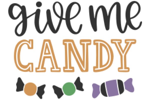
The image features a graphic design with a white background. At the center, there is a stylized depiction of a candy cane, which is a common symbol for candy. The candy cane is colored in shades of orange and brown, giving it a warm and inviting appearance. Above the candy cane, there is a phrase written in a cursive font. The phrase reads "SWEETER THAN CANDY," which is a play on words, suggesting that the candy cane is not just a sweet treat but also a metaphor for something that is better than candy. The phrase is written in a black color that contrasts with the white background, making it stand out. The overall design is simple yet effective, using a limited color palette and a clear, bold font to convey its message. The use of the candy cane symbolizes the sweetness of the product or concept being referred to, while the phrase adds a layer of meaning and intrigue.
Sweetness in Simplicity: A Logo for a Candy Store
Design this TShirt
Design this Mug
Design this Sticker
Download for personal use
Product
Add to cartShare on Facebook
Share on X
Share on Pinterest
Other Designs
