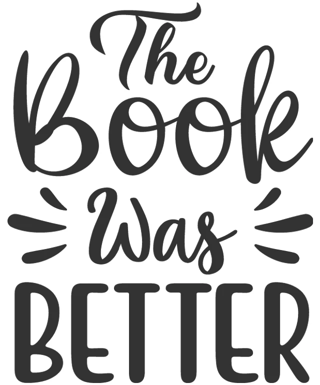
The image features a graphic design with a white background. At the center, there is a stylized text that reads "The Book Was Better." The text is written in a cursive font with a black color, giving it a classic and elegant look. The words "The Book" are larger and more prominent than the word "was," which is smaller and positioned in the middle of the phrase. The word "Better" is the largest and most prominent element of the text. The overall design is simple yet impactful, with the text being the main focus.
Like
The Book Was Better: A Graphic Design
$22.95 USD Sale price $20.00 USD
Design this TShirt
Design this Mug
Design this Sticker
Download for personal use
Product
Add to cartShare on Facebook
Share on X
Share on Pinterest
Other Designs