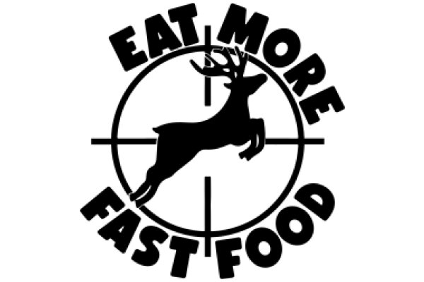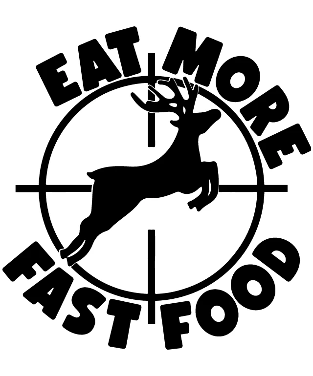
The image features a logo with a playful and somewhat humorous design. At the center of the logo, there's a stylized depiction of a deer's head and antlers, which are rendered in a simplistic, cartoon-like style. The deer is positioned within a circular frame that resembles a target or a bullseye, with a crosshair pattern that suggests accuracy or precision. The logo is encircled by the text "EAT MORE FAST FOOD" in bold, capital letters. The text is arranged in a circular fashion, following the curve of the target-like frame. The words "EAT MORE" are at the top, "FAST FOOD" is at the bottom, and "MORE" is in the middle, creating a balanced and symmetrical layout. The overall design is clean and modern, with a clear emphasis on the text and the deer motif. The use of black and white gives the logo a classic and timeless feel. The message conveyed by the text is a play on the idea of fast food being associated with speed and efficiency, rather than health and nutrition. The deer motif could be interpreted as a reference to the popular fast food chain, but without additional context, it's not possible to confirm this.
Eat More, Fast Food: A Humorous Take on Healthy Eating
Design this TShirt
Design this Mug
Design this Sticker
Download for personal use
Product
Add to cartShare on Facebook
Share on X
Share on Pinterest
Other Designs
