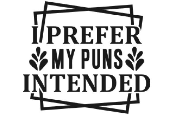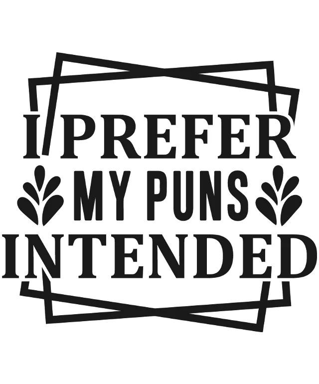
The image features a graphic with a stylized design. At the center of the image is a bold, capitalized text that reads "I PREFER MY PUNS INTENDED." The text is arranged in a way that the words "I PREFER" are at the top, "MY PUNS" is in the middle, and "INTENDED" is at the bottom. The font is sans-serif, which gives it a modern and clean appearance. Above the text, there is a decorative element that resembles a stylized letter 'I' with a line extending from the top right corner, creating a sense of movement or direction. This design is also black and white, maintaining the monochromatic theme of the image. The overall style of the image is minimalist and modern, with a clear emphasis on typography and graphic design. The use of black and white gives it a classic and timeless feel.
Prefer My Puns Intended: A Collection of Witty and Whimsical Wordplay
Design this TShirt
Design this Mug
Design this Sticker
Download for personal use
Product
Add to cartShare on Facebook
Share on X
Share on Pinterest
Other Designs
