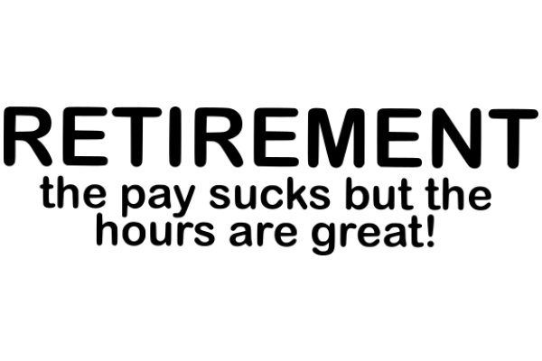
The image features a plain white background with a text overlay. The text is in black font and reads "RETIREMENT THE PAY SUCKS BUT THE HOURS ARE GREAT!" The text is arranged in a block format with "RETIREMENT" at the top, "THE PAY" in the middle, and "BUT THE HOURS ARE GREAT!" at the bottom. The font is sans-serif, which gives it a modern and clean appearance. The overall style of the image is simple and straightforward, focusing solely on the message conveyed by the text.
Like
Retirement: The Payback for Hours of Service!
$22.95 USD Sale price $20.00 USD
Design this TShirt
Design this Mug
Design this Sticker
Download for personal use
Product
Add to cartShare on Facebook
Share on X
Share on Pinterest
Other Designs

