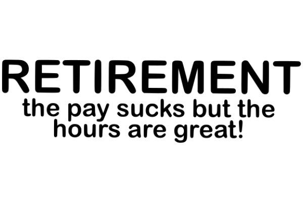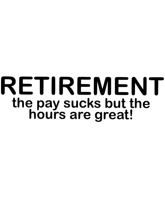
The image features a black and white banner with the word "RETIREMENT" prominently displayed at the top in large, bold letters. Below this, there is a statement that reads, "The pay sucks but the hours are great!" The text is in a smaller font size compared to the word "RETIREMENT." The overall style of the image is simple and direct, with a clear message conveyed through the text. The use of black and white gives the image a classic or timeless feel.
Like
Retirement: The Payback for Hours of Service!
$22.95 USD Sale price $20.00 USD
Design this TShirt
Design this Mug
Design this Sticker
Download for personal use
Product
Add to cartShare on Facebook
Share on X
Share on Pinterest
Other Designs

